Jiaxin Li
Me, My Data
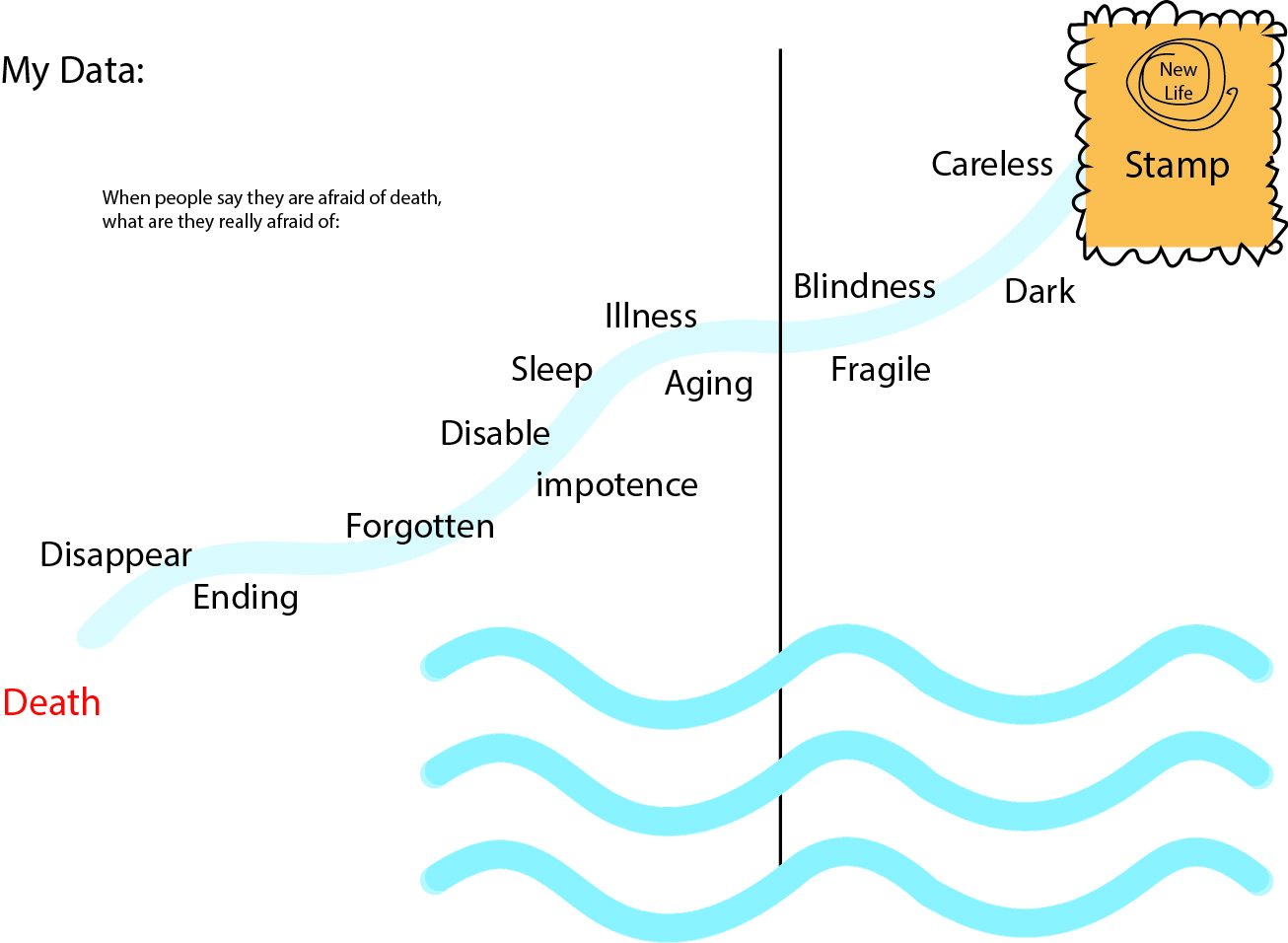
I believe life is sometimes just like water, it keeps growing…growing… until we meet our end, the sea, where all of growned people getting togetherhappily, hopefully, waiting to welcome new people to our final heaven.
In “Me, my data” project. I spend more time to think deeper about all the open-ended possibilities of death, and made more observations and interviews. When I done my phase 2 interview, I just feel a strong desire to explore more about forms to show my findings and thinkings. So here the project borned.
Here is my first product for this project, in a postcard size. I like the postcard size, it’s delicate, enough space to deliver things and don’t leave too much embarassing blanks.

There is one question during my interview session that is “What do you really fear about when you say you fear about death?” I only ask this question to people who admit they arehaving kind of fearness towards death.
People’s answers are actually long and pointless, I can tell the most of them never thought about this question before, so this question took time for them to think about while interview.I processed every sentence people said, and get a few keywords from their answers, and put them in the postcard from the lightest to the heaviest fearness.
Here comes my second product for project “Me, My data”. This one is in a poster size

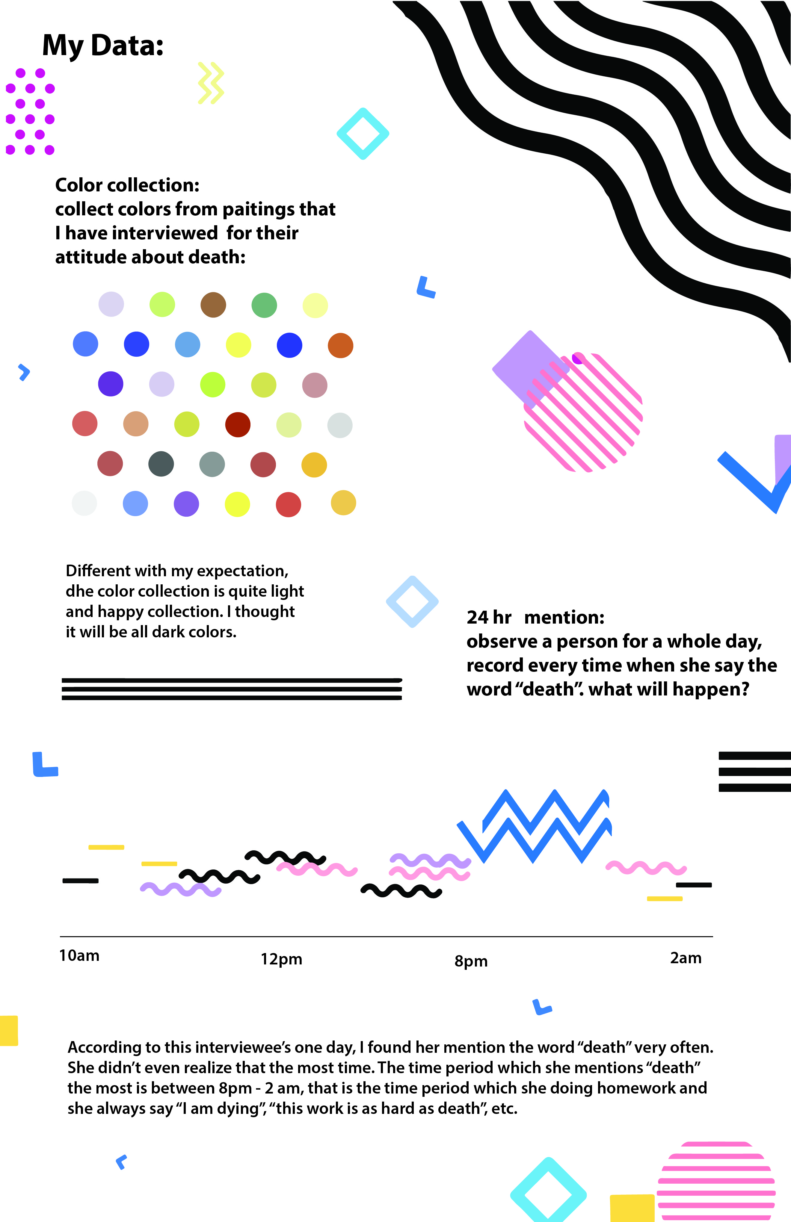
In this poster, I tried to combine what I have findouts to a strong style in order to achieve an overall harmony in both logical and visual aspects.
The first part in this product is about color collection. In the interview session, after all thequestions about death, I asked all the interviewee to draw an abstract painting to depict their thoughtand feelings when doing that interview exercise. In color collection, I picked every color appeared in their painting. What amazed me is, quite different from what I soppose, the overall color collection is quite colorful, most of them are light colors. I thought it can reflect people’s positive attitude towardsdeath to some extent.
The second part in this product is an visual recording of my observation regarding to death. I chosean interviewee, and observed her for a whole day to record every time slot and content when she speak anything about death. Here I made a visual infographic according to this observation. I using straight and short lines to represent “1” , using short curly lines to represent “2”, and the strong waving linesto represent “3”.So it could show the relationship of how many death reference in her daily talk to her time slots
I do feel thrilled to do this project, and I feel confused about that in the beginning. However, now I think it might because I have discovered a really creative way of doing data visualization. I am quitesatisfiedwith this project, I thought it gives me more chance of exploring the design world.